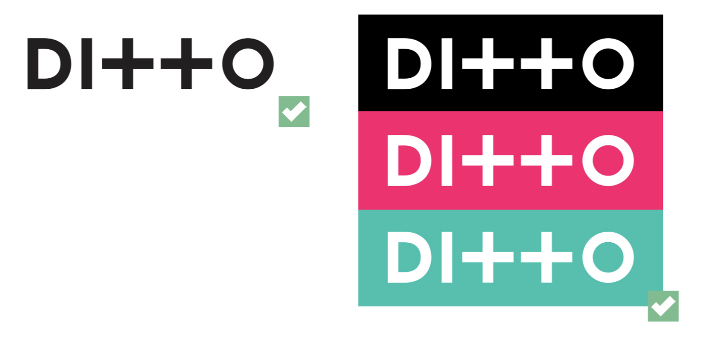
The logo is the most important visual representation of Ditto Music. The logo was developed several years ago, and has remained the same through a series of brand changes.
When Ditto Music was conceived the service was originally going to be called "You and Us", before the name ditto was settled on, but the meaning remained the same. This is represented in the logo with the two pluses, representing ourselves and the customer. The pluses have since become the stamp of the brand in an ajoining badge, which we use as the main logo for our new record label services website.
As Ditto has expands, its impertive that the logo be used in the appropriate fashion, to maintain the consistency of our brand. This guide will show you how and where to use the logo, and what not to do.

The icon was developed in 2018 as a simple way of shortform stamping the Ditto brand. It’s currently being used as the main logo for any Ditto Music output relating to Record Label Services, and can be used on social media when showcasing percentage clients and playlist achievments.
The logo should always have room to breathe when used on any documentation. The guide will show you the minimum amount of space required when placing the logo, which equates to half a character on each side.


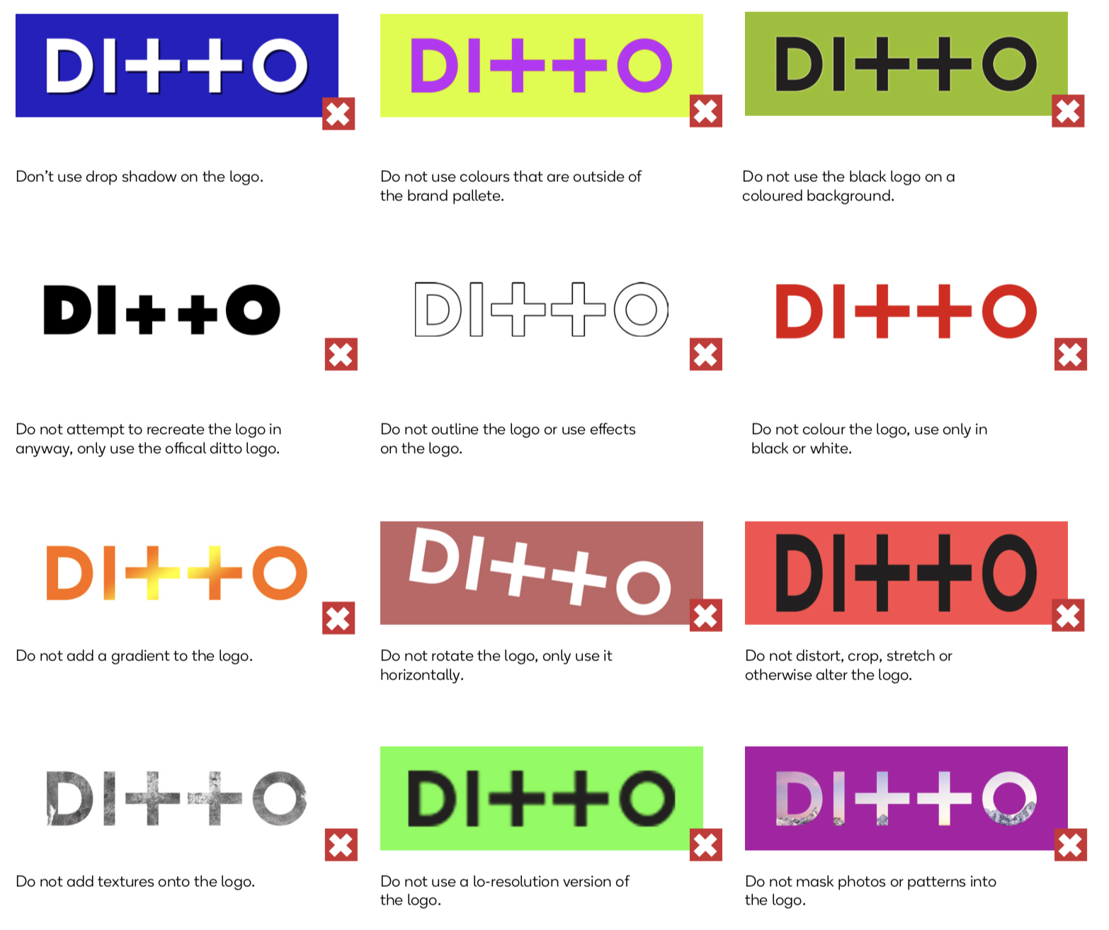
The Ditto Music logo must only be presented in black or white, and not be edited, distorted, or effected in any way. However the white logo can be placed on a coloured background, or in a coloured rectangle to the size of the exclusion zone.
The colours used must be pulled from the Ditto Music brand pallet, which you can find in this guide.

The logo must always be presented in horizontal form, at a readable size, unobstructed by competing visual elements.
The logo MUST NOT be recreated in anyway the official logo must be used in all circustances.
This guide will show you the do’s and don’ts of the logo.

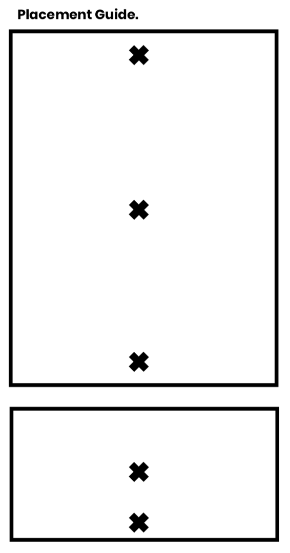
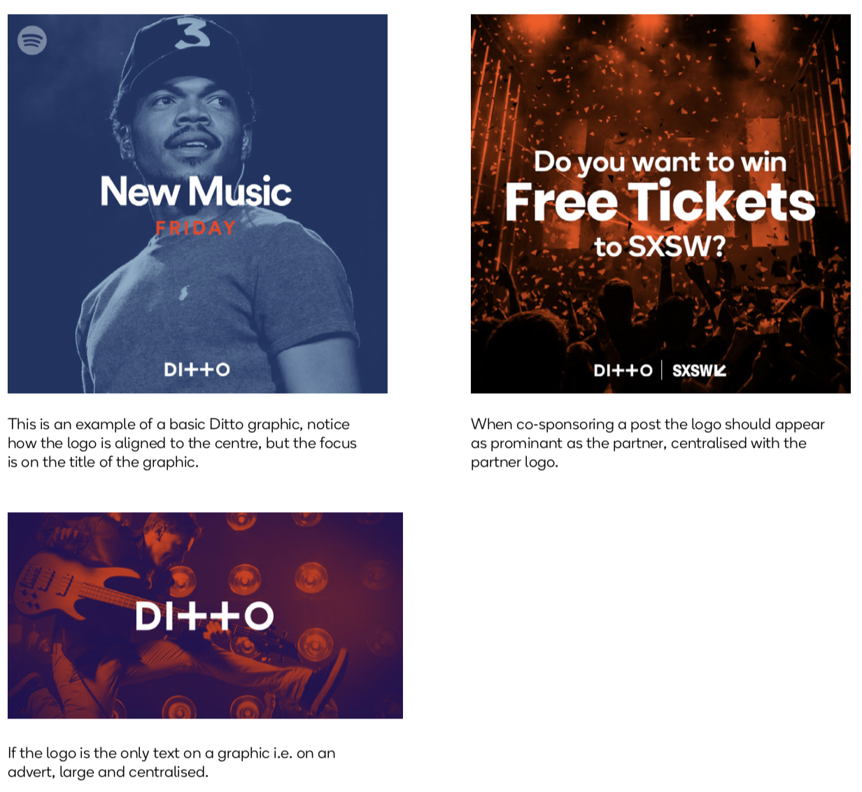
Placement of the logo on graphics is important. The logo always needs to be prominant, readable and centrally placed.

